
I will continue to customize it as I add my information! Im excited to compile my portfolio how I want. Its nice to have the ability to customize the website so personally!
Lesson Task- Market your website
1. Do some research on what advertising costs. You could for instance contact your local newspaper, print shop and other websites.
https://www.webfx.com/social-media/how-much-does-facebook-advertising-cost.html
The above link I found shows the average pricing for facebook ads. I think facebook is a great way to touch base with all types of people and while browsing people are very likely to have time to click and check out any links or ads that catch their eye.
A list of how to market the website:
- I would create the ads for the different platforms. Maybe even a video.
- Do proper research on the SEO and how to optimize my website coming up in search with tags.
- Be consistent in posting and have a trustworthy profile with credibility that interacts with possible customers.
- I would use facebook ads, instagram sponsored posts, and target a few travel blogs to have ads on those sites.
What if you had double the budget? Come up with a second marketing strategy, this time with NOK 20 000 at your disposal. (3600 $ US)
- ad in youtube ads
- be even more involved with sponsors, facebook ads, insta ads, and blog ads
- Review every few days which ads are working best and getting most website views and make the adjustments accordingly
Come up with a viral idea. It doesn’t have to be a video; it can be guys dancing at the airport in gorilla suits. You can use ANYTHING that is at your disposal. Be creative!
I love food. My eye is always caught when watching a video about food. I imagine a shot where the camera is on a guy sitting on the best view out over lofoten and there is really loud crunching in the background because someone is eating something. The crunching continues and the guy looks over to where the crunching noise is. There is another guy munching on those dried crispy fish chips. And then the camera goes back to the guy trying to enjoy the peace. Then at the end introduces lofoten islands with a punchline.
https://business.instagram.com/advertising/
https://smallbusiness.chron.com/insert-adsense-ads-inside-blogspot-posts-30157.html
Planning the structure
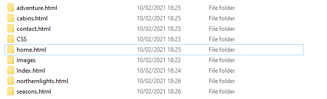
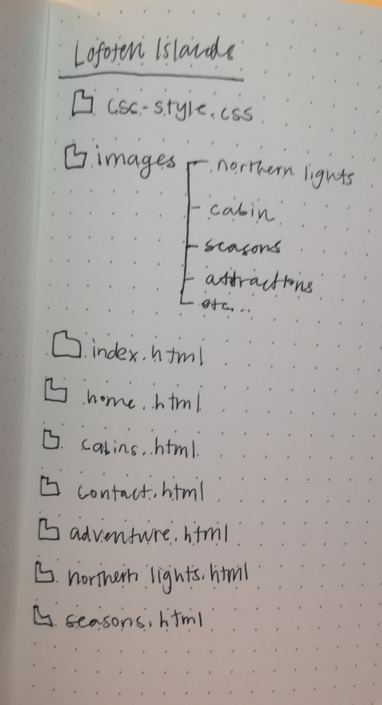
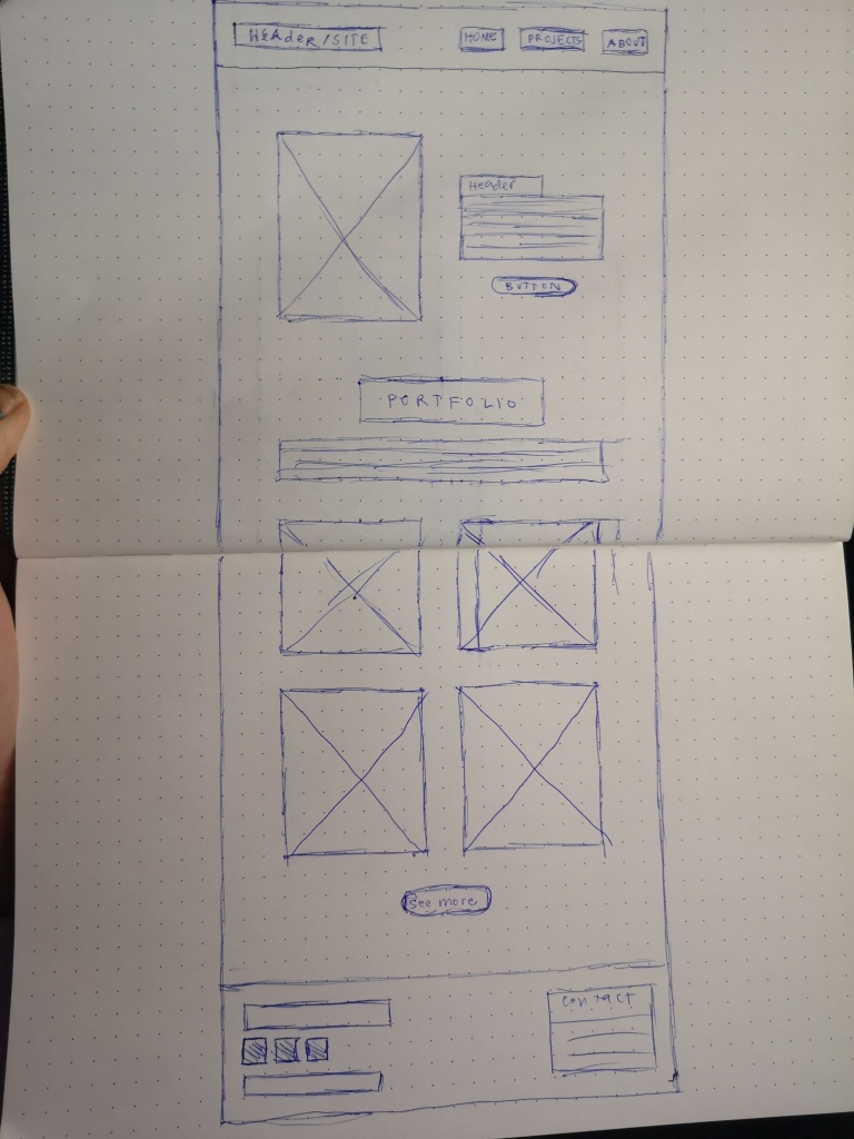
Create the structure of your web page (from Lesson Task – Put Thought Into Your Design) in terms of HTML files and folders. You need to set these up so that you are ready to code your website.
First use a pen and paper to do your planning; then do it on the computer when you are sure of your structure.
Please upload this activity to your WordPress blog. Remember to scan (or photograph) and include your initial planning that you did on paper.
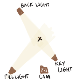
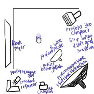
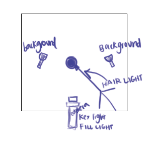
Lesson Task- Studio lighting
3 Lighting sources and their functions
- Flat light- when you have your light source facing directly at the front of your subject. No shadows on face
- 2. Split light- side lighting that hits the face at a 90 degree angle. Look tough and masculine
- Backlight- light comes from behind. You can get a semi sillhouette and focueses heavily on the atmosphere and light
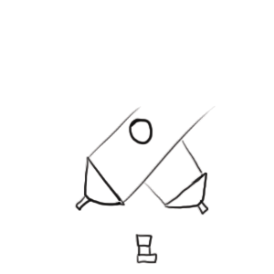
name 2 light modifiers and the difference between them:
- Light Shapers which are devices that bend light into particular forms. They fit over studio lights to allow for more control over the size and direction of light.
- Bouncers, Reflectors, and Absorbers are used when you need to minimize shadows, turn to reflector boards and reflecting umbrella lights. These accessories bounce light off surfaces, softening, diffusing, or redirecting it.
Lighting for portrait, fashion, and beauty shots
5 Web Pages
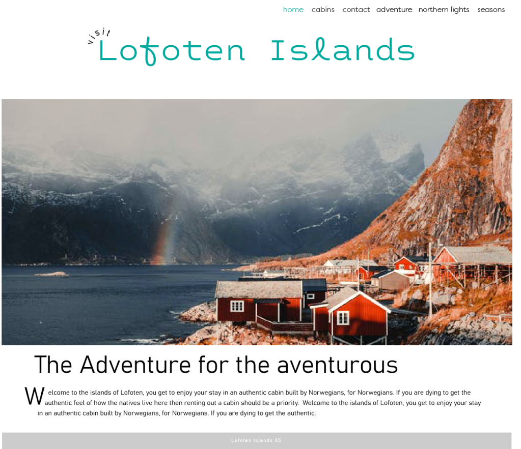
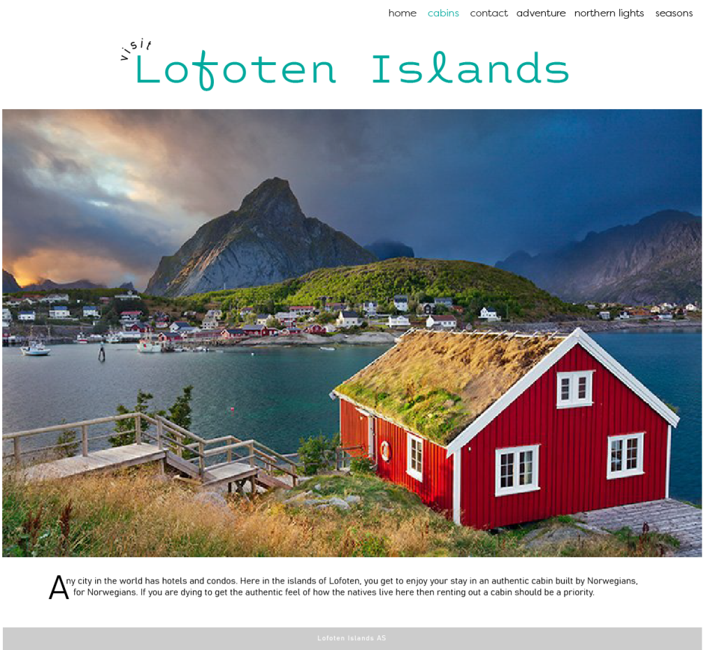
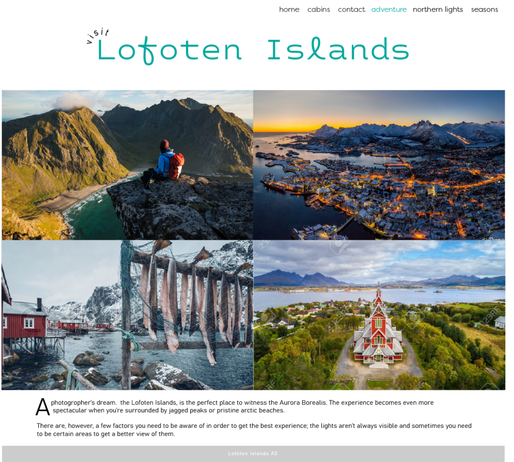
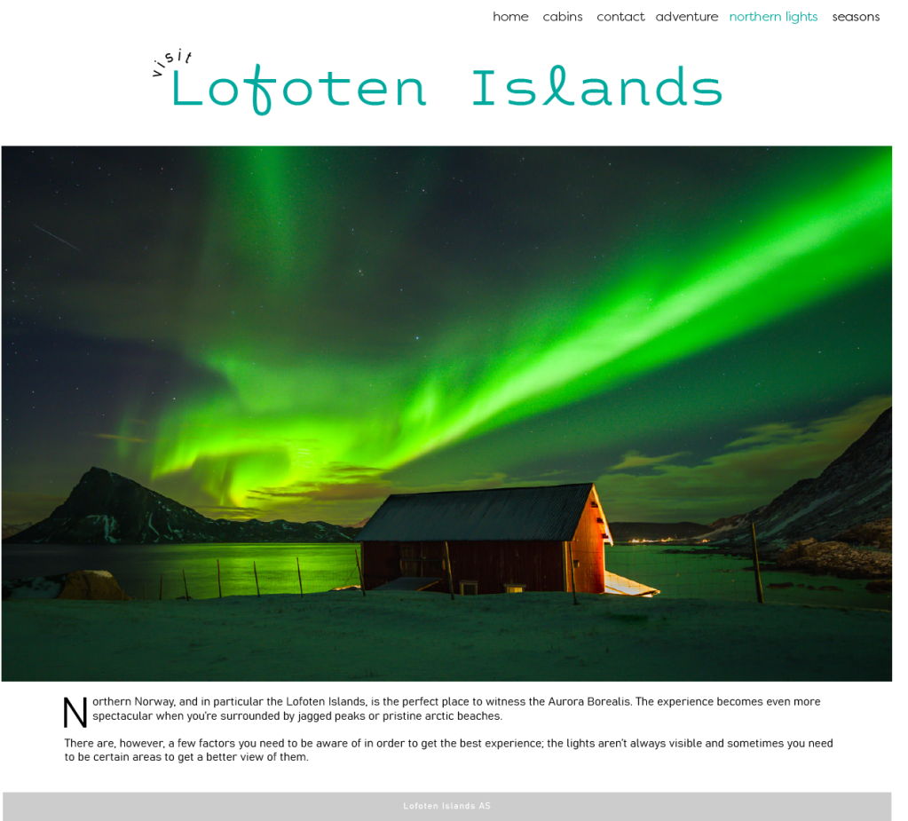
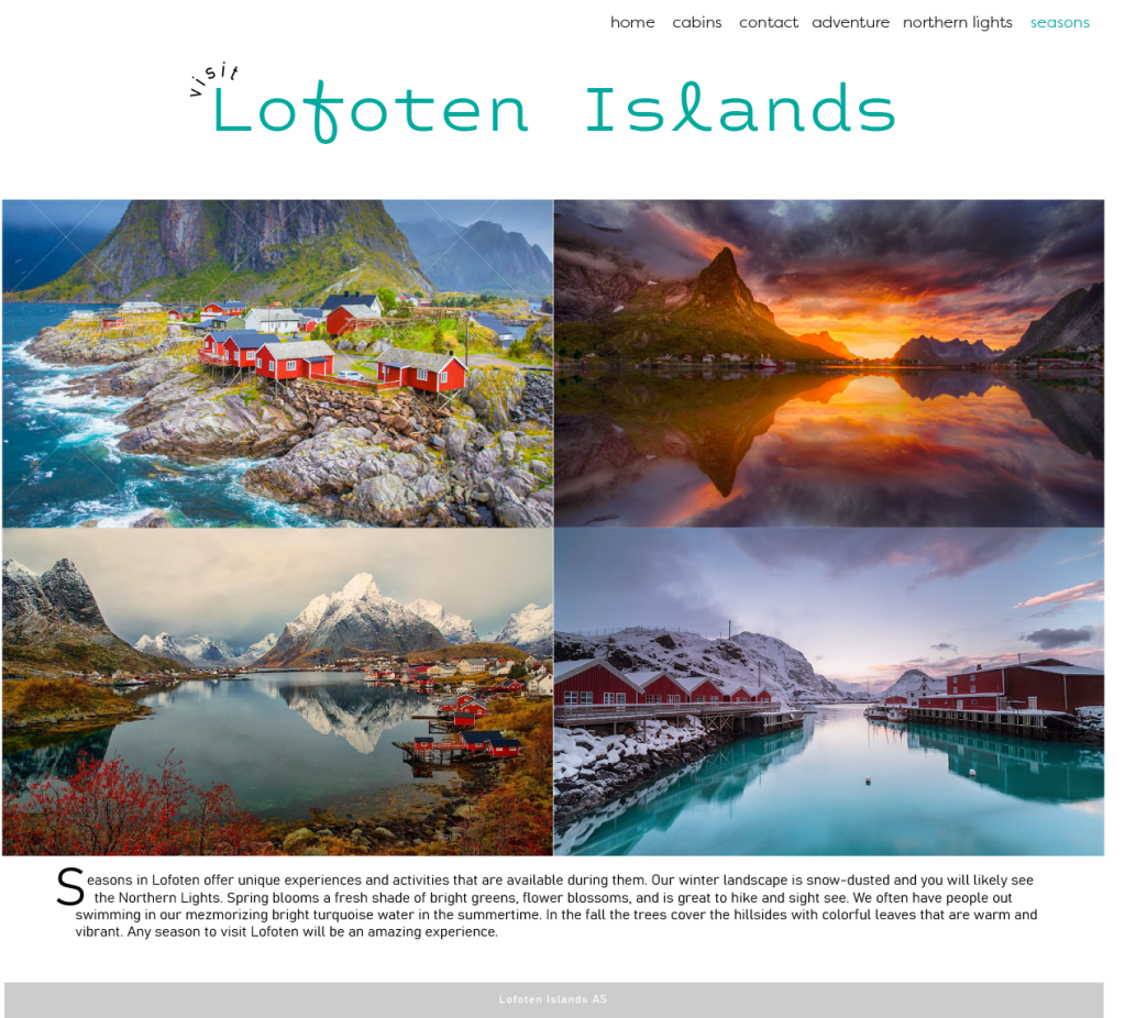
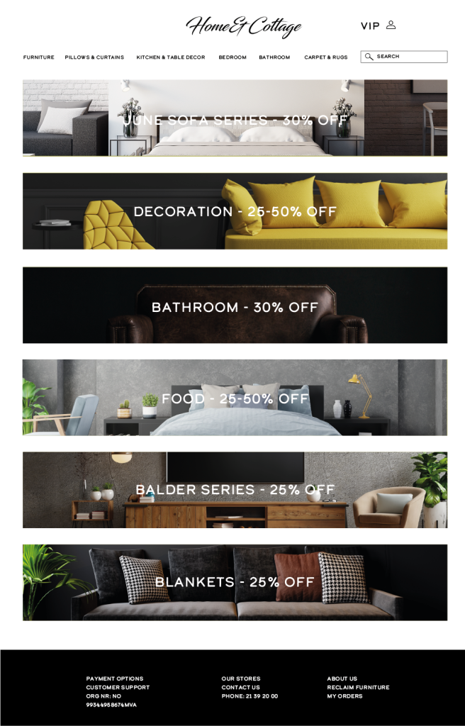
I chose to use Lofoten for my website pages.
Step one of making a website is to establish goals. Mine was to share information about Lofoten and get the viewer to want to plan a trip here.
Step two: Who is your audience? I was thinking travelers and photographers between the ages of 20-40 who love being outdoors, seeing majestic views, and enjoying nature, hiking, and other outdoor activities. Likely people who enjoy design and photography.
Step three: Brand. I made a list of things the brand represents..
Authentic. Adventurous. Invigorating. Down to earth. They want to share authentic Lofoten with these viewers and show them how amazing it is.
Step four: Solve the problem. The problem here is that people might not be inclined to visit Lofoten because there is a lot planning and uncertainty about what it is and if the sites are good enough. My web pages solve this by making it very clear that Lofoten has wonderful views, where to stay, when to come, and helps the customer make a plan to visit.
Step five: I would use google analytics to see what is clicked on and how successful
Then i can do step 6 and make updates.
3 web designs
We were asked to pick a website and redesign it into 3 different styles. I chose the styles by choosing a few theme words that I wanted that page to capture which I have written under the images.
Earthy. Clean. Down to earth. Fresh.
Smooth. Sleek. Strong. Bold.
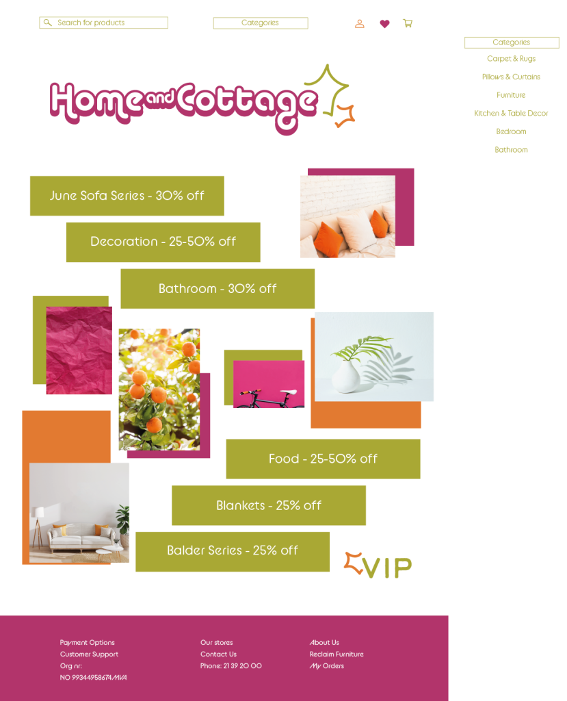
Fun. Vibrant. Creative. Artistic. Explore. Journey.
- Do you have any existing logo? No (If not, would you like one made?) Yes
2. What image, look, or feel do you want your brand’s website to portray? Warm, Vibrant, Bold, Instinctive, Honest, Welcoming
3. Who will be responsible for maintaining the website? Will the person have the time and skills to do so? Shay aka myself. Skills are beginner.
4. Where is the website content coming from? Shay aka myself.
5. Do you have any colour preferences? What should the look and feel for the website be? Warm and inviting tones. Bold yet welcoming.
6. Who will be the contact person for this project? Shay
7. What do you NOT want on your site in terms of text, content, colour and graphic elements? No bright blue, green, purple. Not tacky. Not too mainstream or minimalist looking. Interesting color tones, funky fonts and expression.
8. What features should be used on your website? (This includes things like contact forms, pictures, videos, etc.) Pictures, descriptions, contact info, email newsletter.
9. What is your deadline for completing the site? How big is the budget? Deadline is March 2021.
10. What will be the primary goals of the new site? (Engage, Inform, Sell) Inform potential clients/employers of my work, prices, and availability.
Get the basics right pt 2
10 good websites
https://bysophialee.com/ Great dsign, easy to use, clean, minimalist, good for target audience, email chain, directs customers to courses, orgnanized
https://www.mixbook.com/ great layout, easy to navigate, organized, all the right contact buttons, great usage of elements
https://www.nike.com/no/en/ offers products easily, engaging, stays with brand identity, meets purpose of selling
https://custom.ultimateears.com/pages/ue-fits/ unique design, memrable, stands out from competitors, engaging
https://boostedusa.com/ easy to navigate, nice accent colors, lots of information organized, lots of fun pictures
https://workstack.io/ meets the point for target audience
https://www.wealthsimple.com/en-us/ great clean design, easy to navigate
https://toggl.com/ great colors, interesting logo and element usage, memorable, brand is open about mission
https://colourpop.com/ easy to use, adaptive, vibrant, appeals to target, brings sales
10 bad websites
https://jamilin.com/ bad design, not clean, wordy, messy
Gatesnfences.com bad colors, wordy, crazy, disorganized
Pennyjuice.com awful color use, text size bad, information is not engaging whatsoever
http://www.rudgwicksteamshow.co.uk/ awful color choices, unreadble font colors, bad layout, bad pictures
http://ww1.electrifyingtimes.com/ very boring and unprofessional
http://www.irishwrecksonline.net/ bad colors, bad layout, no mission found easily
http://www.arngren.net/ way too chaotic and overwhelming
http://www.serene-naturist.com/Naturist.html so many desings goiung at once, bad contrast, too many colors
http://www.alpha1teclabs.com/ bad colors, messy, hurts eyes, no mission found, too much going on
CONCLUSION: a good website needs to have a mix of being artistic and engaging in some way and being simple, easy to navigate, purposeful, and be able to direct a customer in a relaxing way that makes the reader want to keep scrolling or click on the what they are looking for easily. Colors are extremely important and layout of information, typography, and how much info to include in a block is all very important to how a website feels to a customer. The most important things is that the customer is able to get to the purpose of the website overall. Inform, sell, or share.. whatever the company benefits from how the customer uses the site.. it should be a clear path for the customer to accomplish that goal and be very accommodating in a tasteful way to the viewer in a way that truly represents the brand identity.
